a new beginning
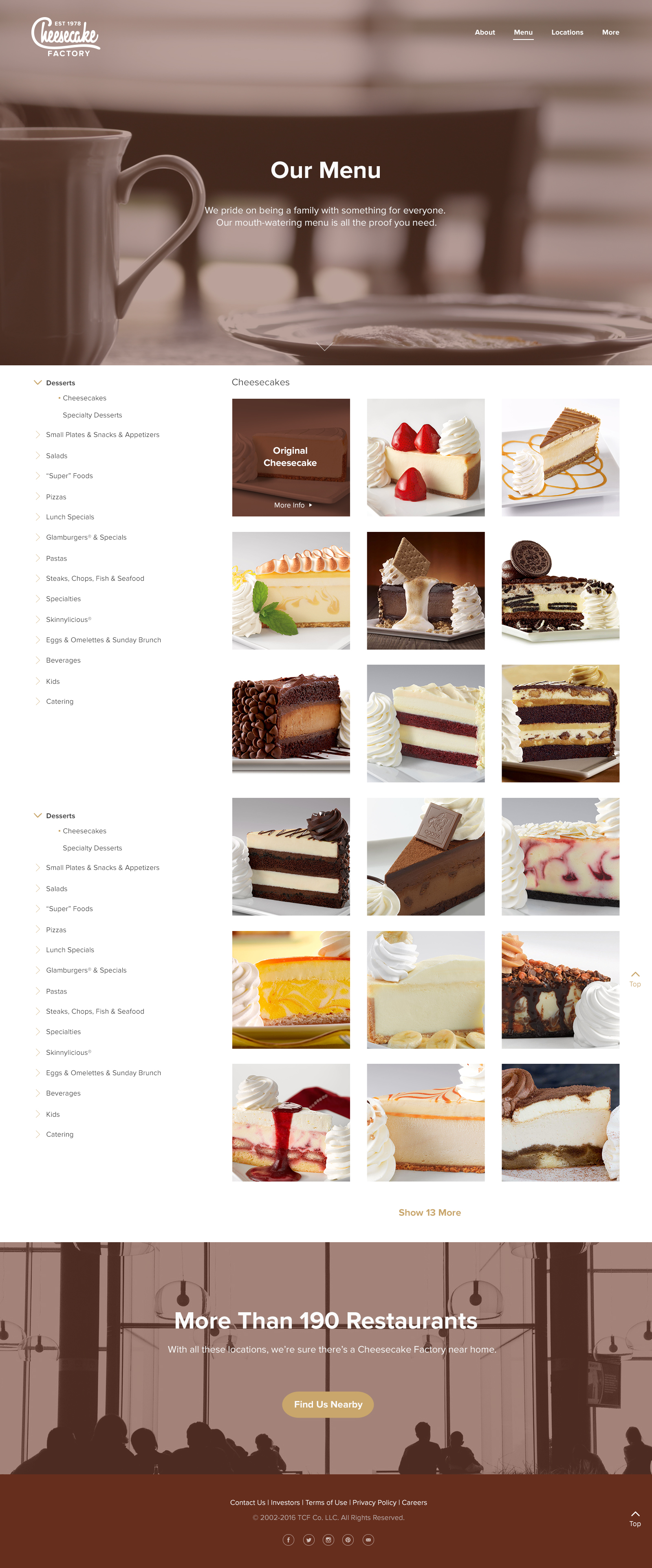
As a fictional redesign project, I chose to do The Cheesecake Factory as its current identity appears dated and stuck in the past, without any sense of forward movement. However, the homely feel of the founding family was captured to some extent in the logotype. It’s also noted that customers have shared endless complaints about poor customer service, restaurant spacing, and more. With the new identity, The Cheesecake Factory would ideally be promising better customer service and branch renovations after the launch of its new identity.


reestablishing the family culture
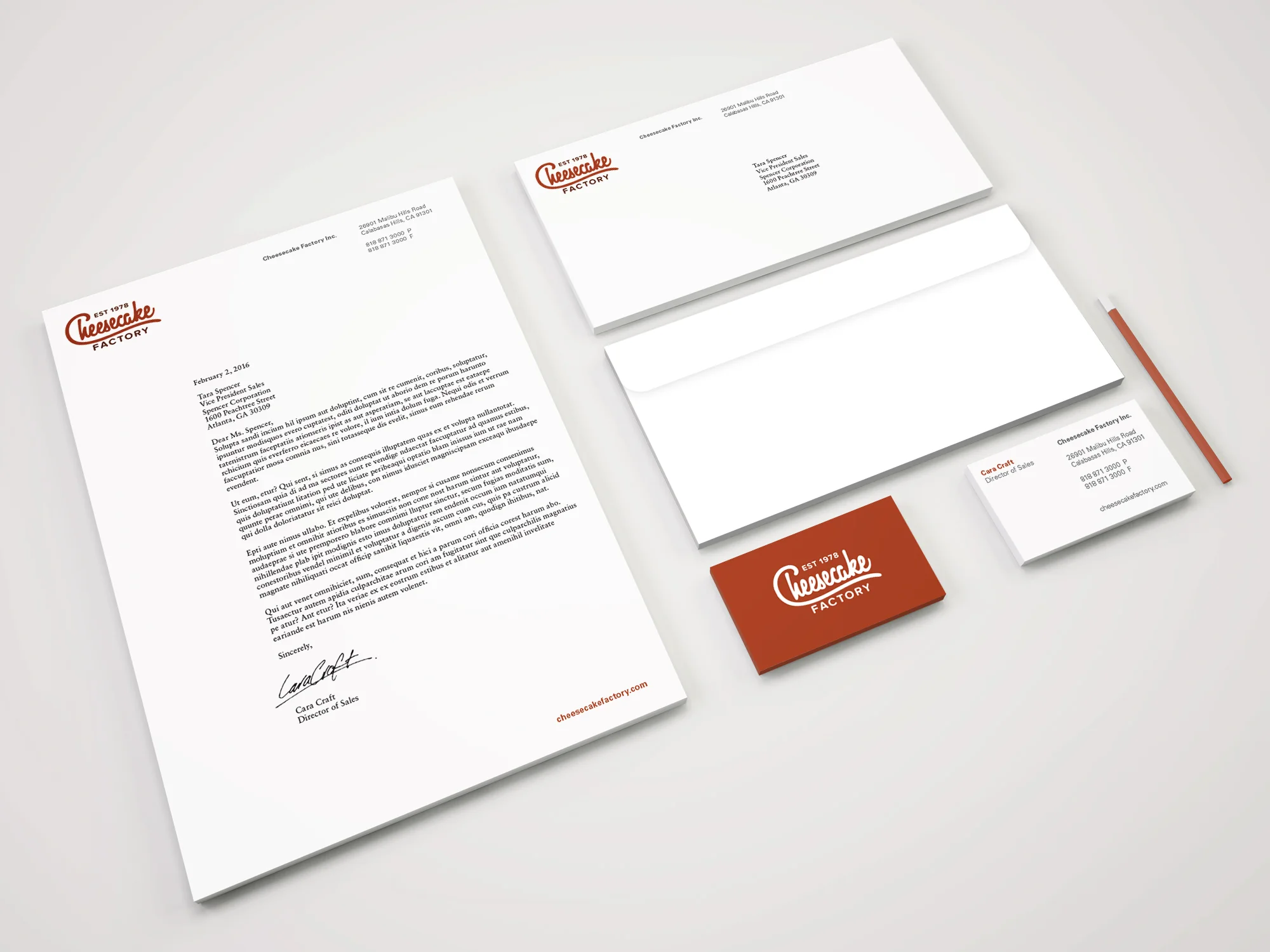
The Cheesecake Factory is more than a franchise. It’s a home that is dedicated to improve its services and branches to better suit its family members, i.e. its customers. The identity reestablishes trust in the hearts of its current customers, and generates interest in potential customers.
Their new identity also carries a sense of innovation and improvement that will continue into the future years of the company, even as it expands across the globe. The customers can trust that The Cheesecake Factory will not stop improving after the launch of its new identity.